|
|
Post by Per on Aug 1, 2012 18:48:43 GMT
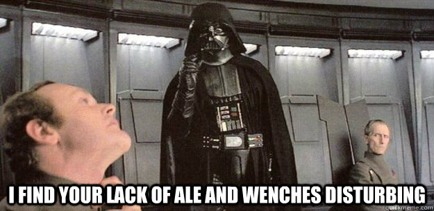
This thread is what made me come out of lurker-mode. And I made this to appease the deities known as Forum Goers. A little rough with the lettering, but very funny! I find that Ale and Wenches 8pt bold with RGB set to #303030 creates a good likeness. (Consequently I'm not sure how to do actual bolding.) |
|
|
|
Post by Eversist on Sept 27, 2012 16:09:49 GMT
Does anybody know what font Tom normally uses for his speech bubbles? Some other clever people have found it, I think, but I forgot what the name and type-size was. . As for type size, you're best off just comparing an image with text on top in whatever image editing program you're using. Here's a pretty cool resource on the wiki if you're interested in the other typefaces used in the comic. |
|
|
|
Post by Max on Feb 15, 2013 8:22:52 GMT
(psst where do I get the text from the webcomic?) Ale and Wenches. |
|
eskhn
Full Member
   You like 'em? Huh? You like 'em?
Posts: 167
|
Post by eskhn on Jan 2, 2014 17:24:06 GMT
Is it enough if we just type in regular text and use the font?
|
|
|
|
Post by Per on Jan 2, 2014 17:34:51 GMT
Chapter 52:
No It Isn't You must also bold it and set the colour to #020202And even then it will be slightly off apparently? |
|
|
|
Post by Nnelg on Jan 3, 2014 8:37:26 GMT
Chapter 52:
No It Isn't You must also bold it and set the colour to #020202And even then it will be slightly off apparently? I was able to match the text better by increasing the spacing, although I couldn't match it perfectly.I think Tom resizes his pages before putting them on the site... |
|
|
|
Post by Neon_Knight on Aug 15, 2014 13:34:37 GMT
Something I found that seems to apply a lot here.  Oh, I almost forgot that memes in the GKC world go in Ale and Wenches, not in Impact. -.- Won't happen again, I swear.  |
|
|
|
Post by keef on Jan 5, 2015 17:11:21 GMT
,So just to make things clear,you use photoshop to change the text of one speech bubble or what? The font is ale and wenches, it's free. and tinker with the speech bubbles using Paint.. or paint.net, also free. Welcome, if you ever feel the need, there is an introduction thread.  |
|
|
|
Post by Corvo on Nov 15, 2016 5:10:17 GMT
Gunnerkrigg script? What does it do? I mean font. There's a computer font that emulates Tom's lettering, and I don't have it installed. |
|
|
|
Post by keef on Nov 18, 2016 16:44:03 GMT
We sorta emulate Tom's lettering in that we'd have to know his software and settings to match it exactly. I find that with colour #202020, 8 points and bold, the result is close in Paint Shop Pro. However, I think Tom's is somewhere between 8 and 9 points, and his bold is some kind of double-bold? In the Dutch translation I use black, 9 points, not bold ( but I guess your settings might be closer.) If Tom uses bold in the comic, I simply type the word twice. Bold takes up a lot of space in Ale and Wenches, and especially in the beginning of GKC Tom made the bubbles a bit cramped. |
|
|
|
Post by saardvark on Mar 15, 2019 13:24:38 GMT
Could someone tell me the name of the font Tom uses, and where I might find it? Thanks.
Ales and wenches, I think? |
|
Earin
Full Member
  
Posts: 115
|
Post by Earin on Mar 15, 2019 13:54:14 GMT
Could someone tell me the name of the font Tom uses, and where I might find it? Thanks. Ales and wenches, I think? Yeah, Blambot's free Ale and Wenches font. |
|
|
|
Post by Gemini Jim on Nov 1, 2019 16:00:46 GMT
Loup: "Ahaha! We have the same voice actor!" Must be a rather talented one, speaking in different background colors. But the font is a dead giveaway. All Gunnerkrigg voice actors have to know how to speak Ale and Wenches. |
|